Still Sea
December, 2025
Brand identity, label design, and website for a Salt Lake City–based independent craft brewery
Still Sea Brewing Co. is a Salt Lake City–based microbrewery driven by a passion for craft beer. The brand launched with a small, carefully curated selection of offerings meant to introduce their work through their signature styles. With a commitment to delivering a premium, timeless, and memorable experience, Still Sea seeks to grow its reach and community without compromising its core values.
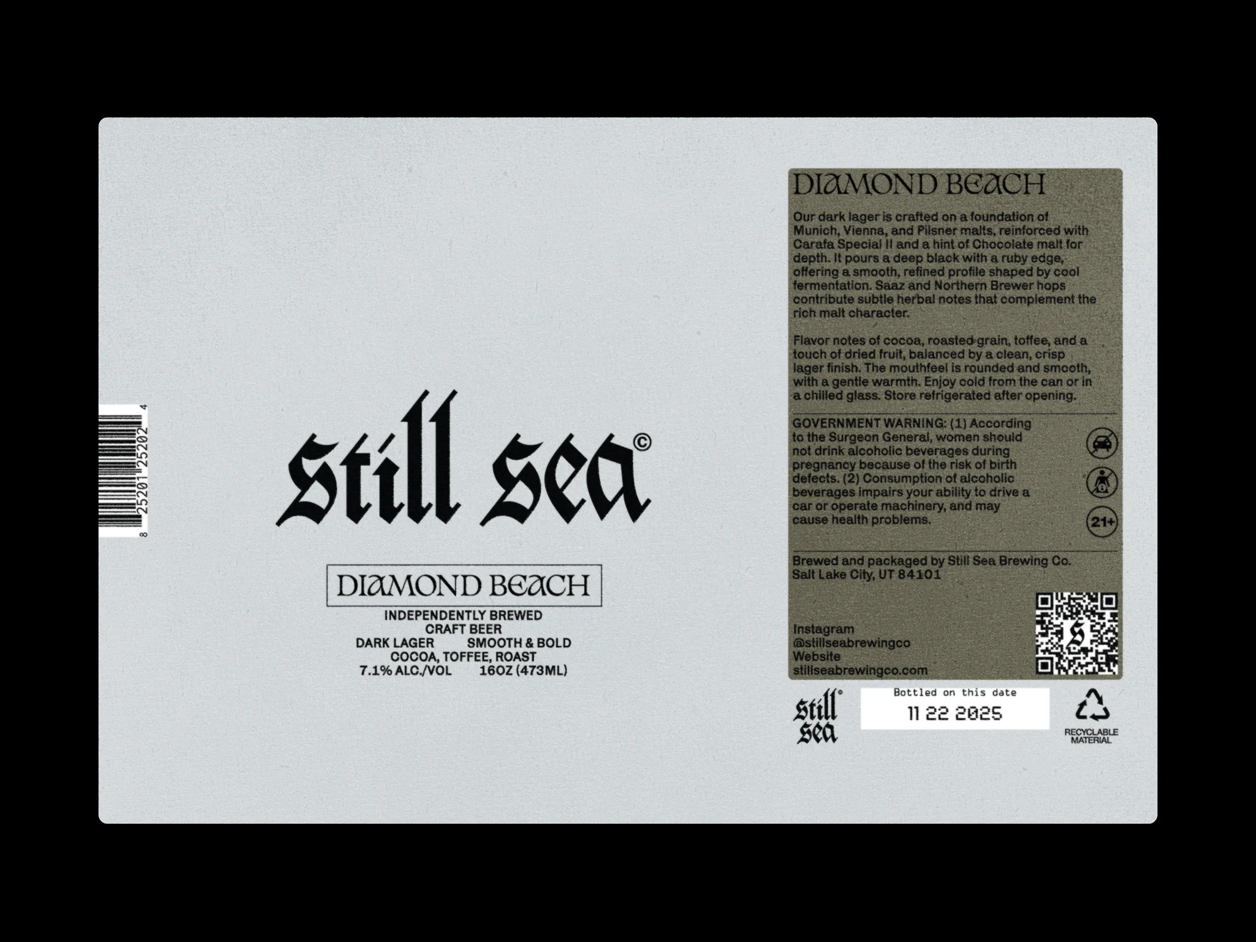
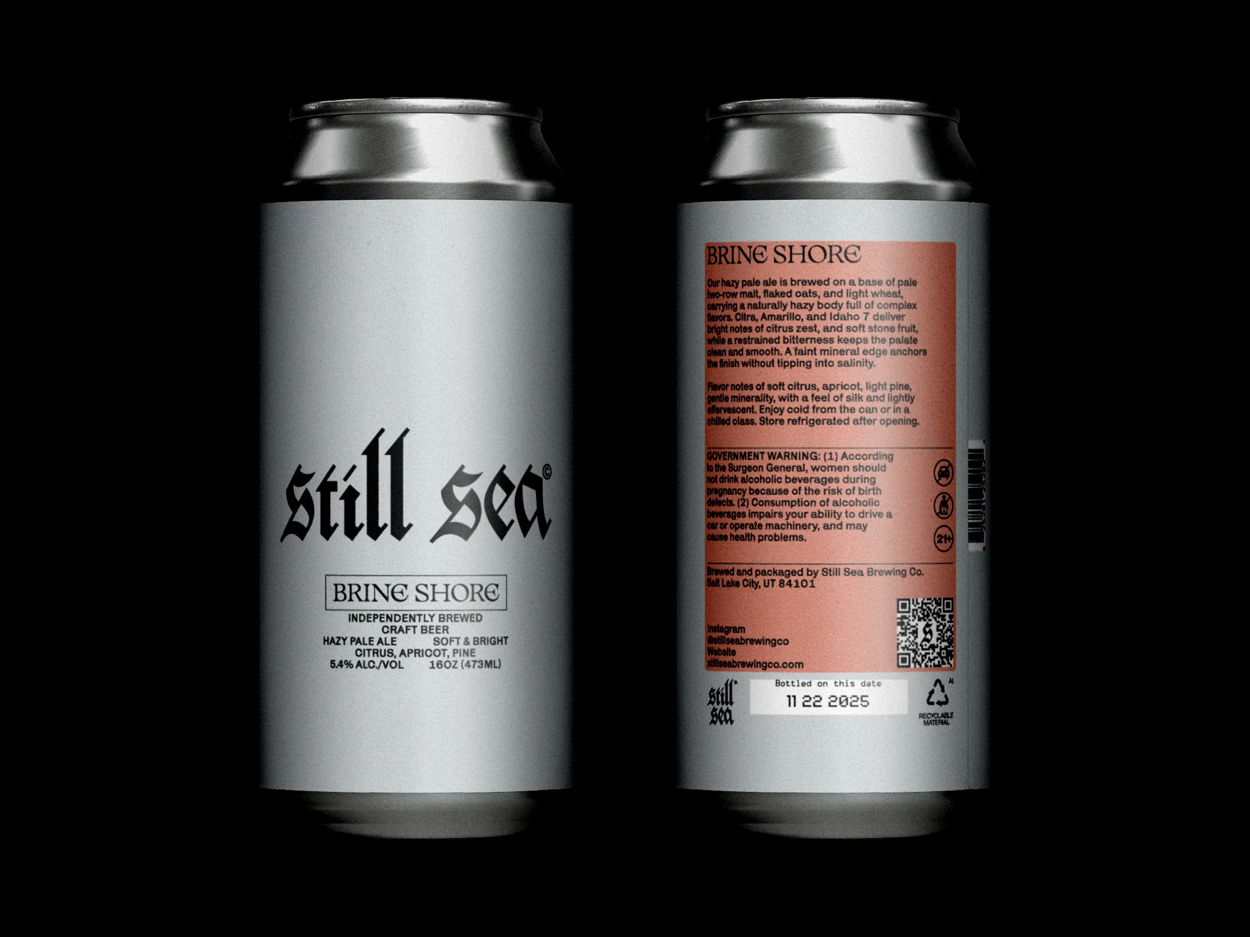
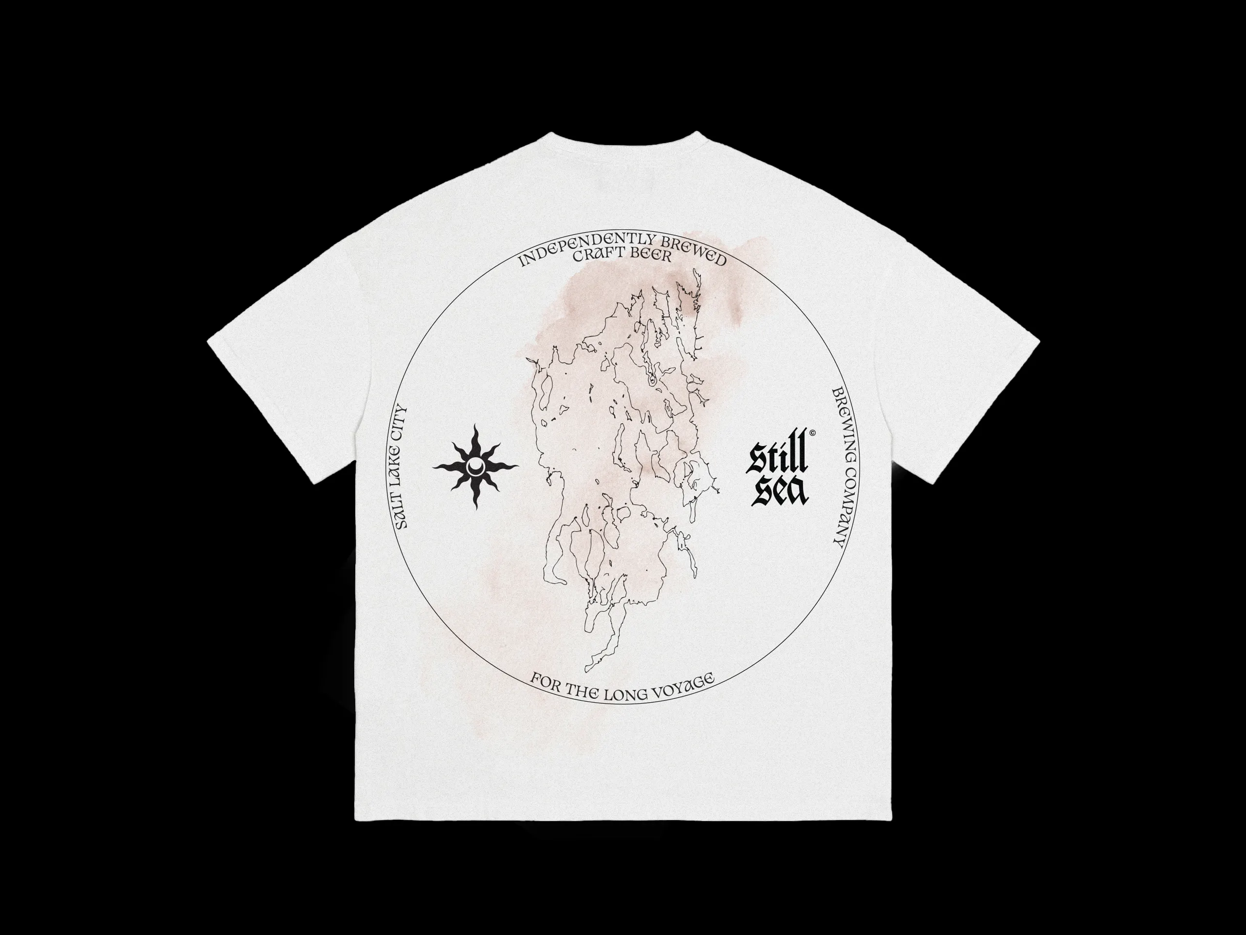
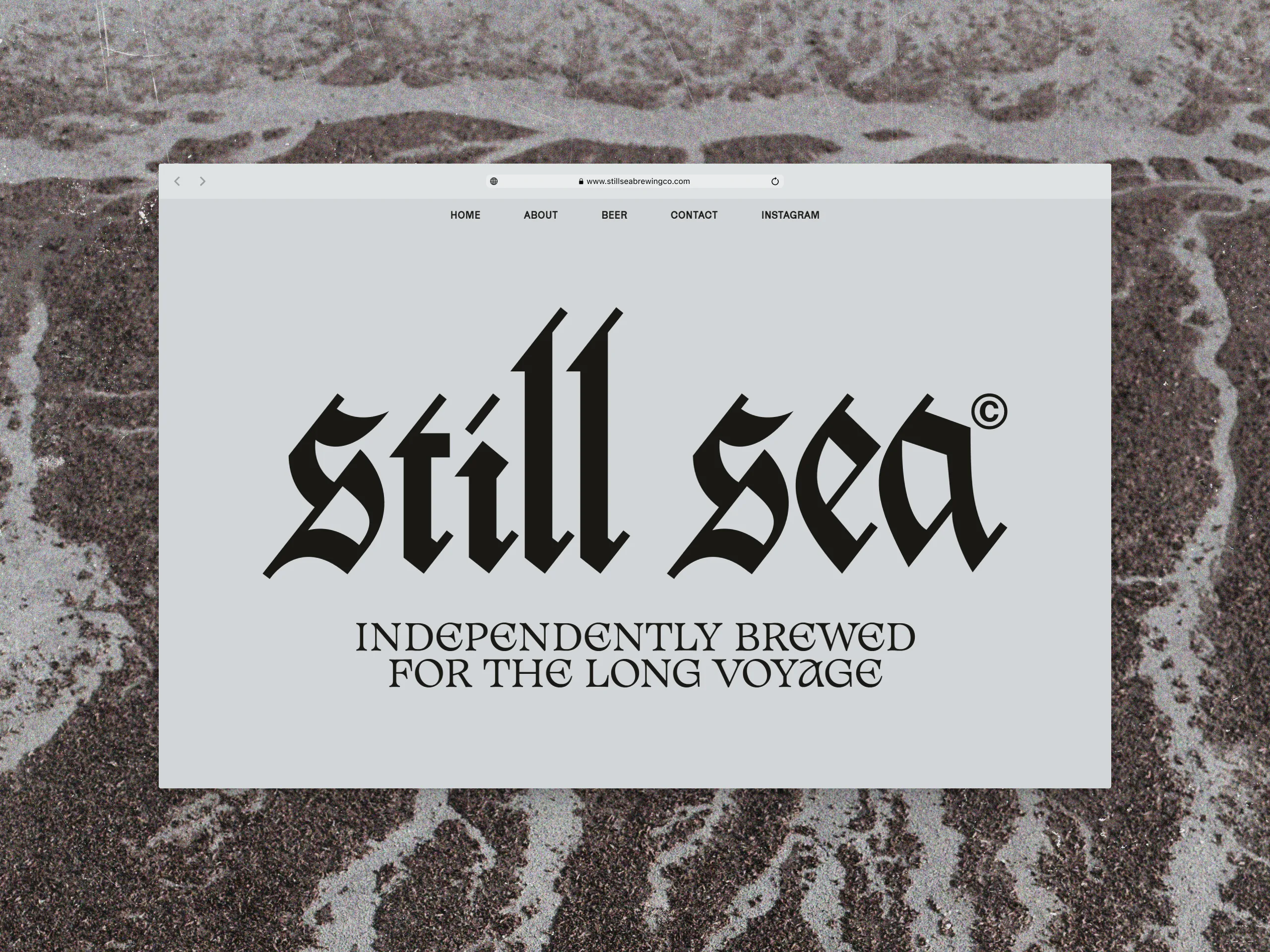
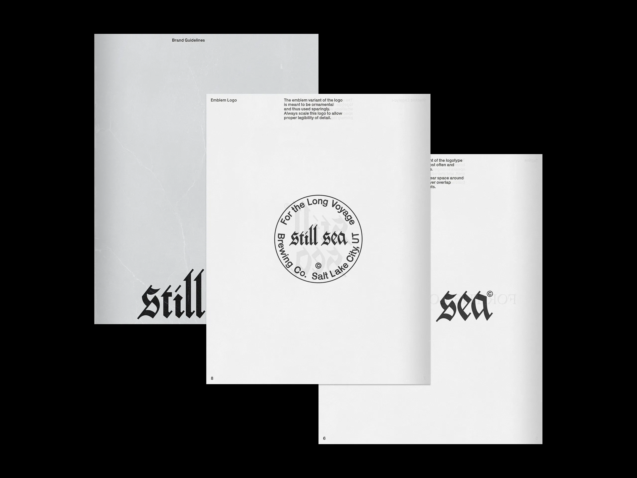
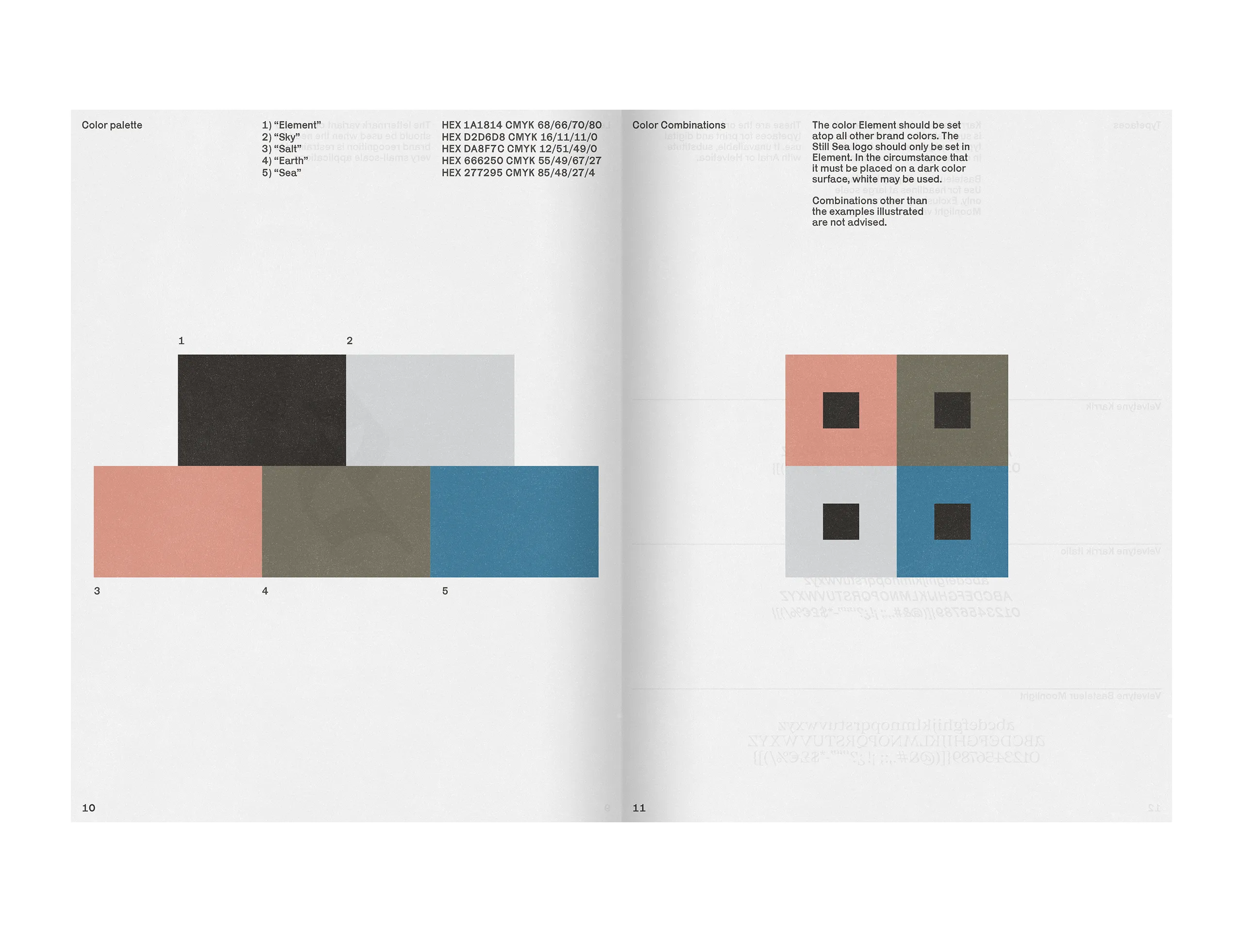
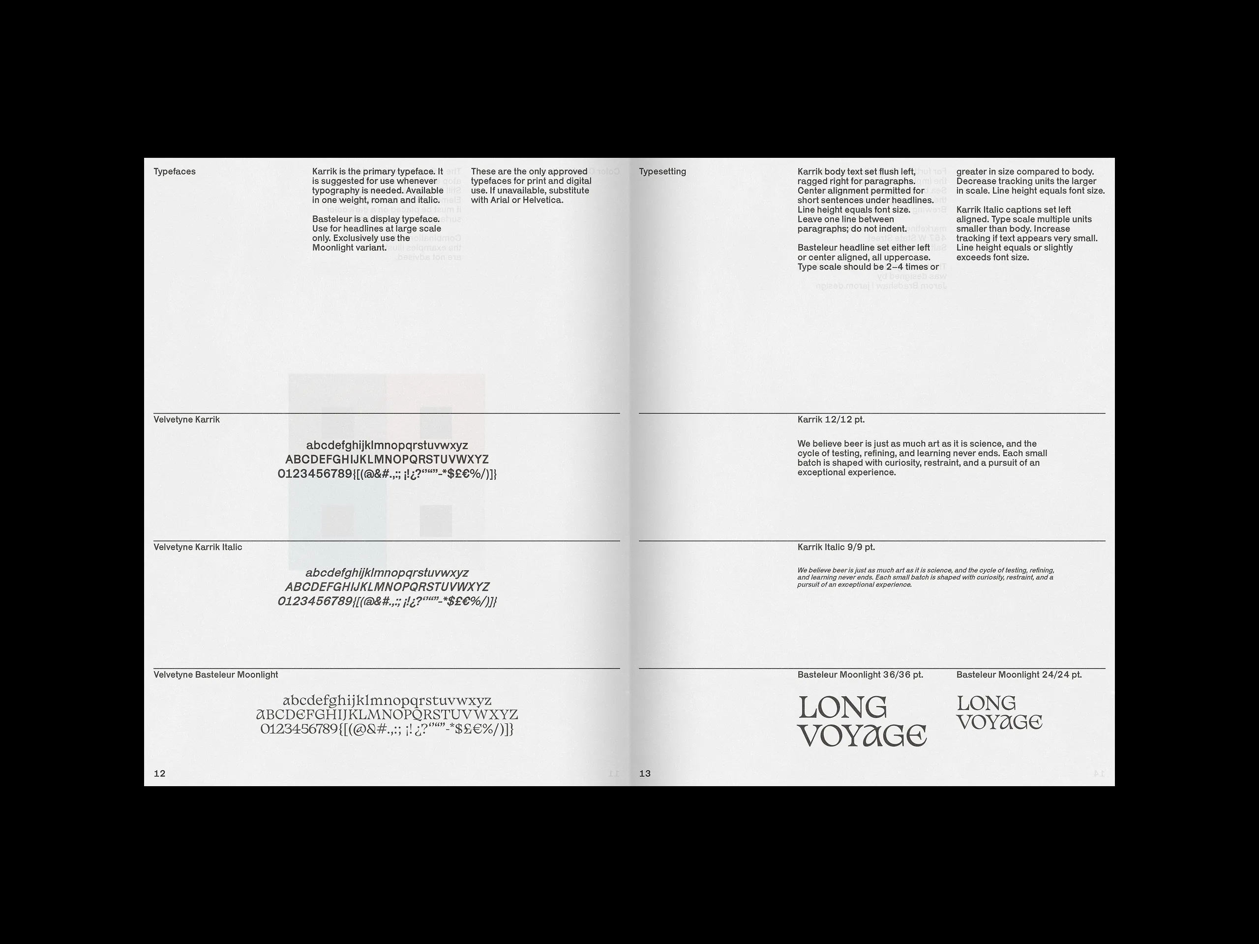
The designs for the brand, labels, and website were approached to encapsulate the cold, wistful, quiet, and melancholic tone central to their identity. The logo draws inspiration from the classical blackletter typeface Caxtonian Black. The color palette references natural materials found around Utah’s Great Salt Lake during winter, grounding the visual system in place and feeling. The selected typefaces bridge the gap in developing a modern yet vintage character.
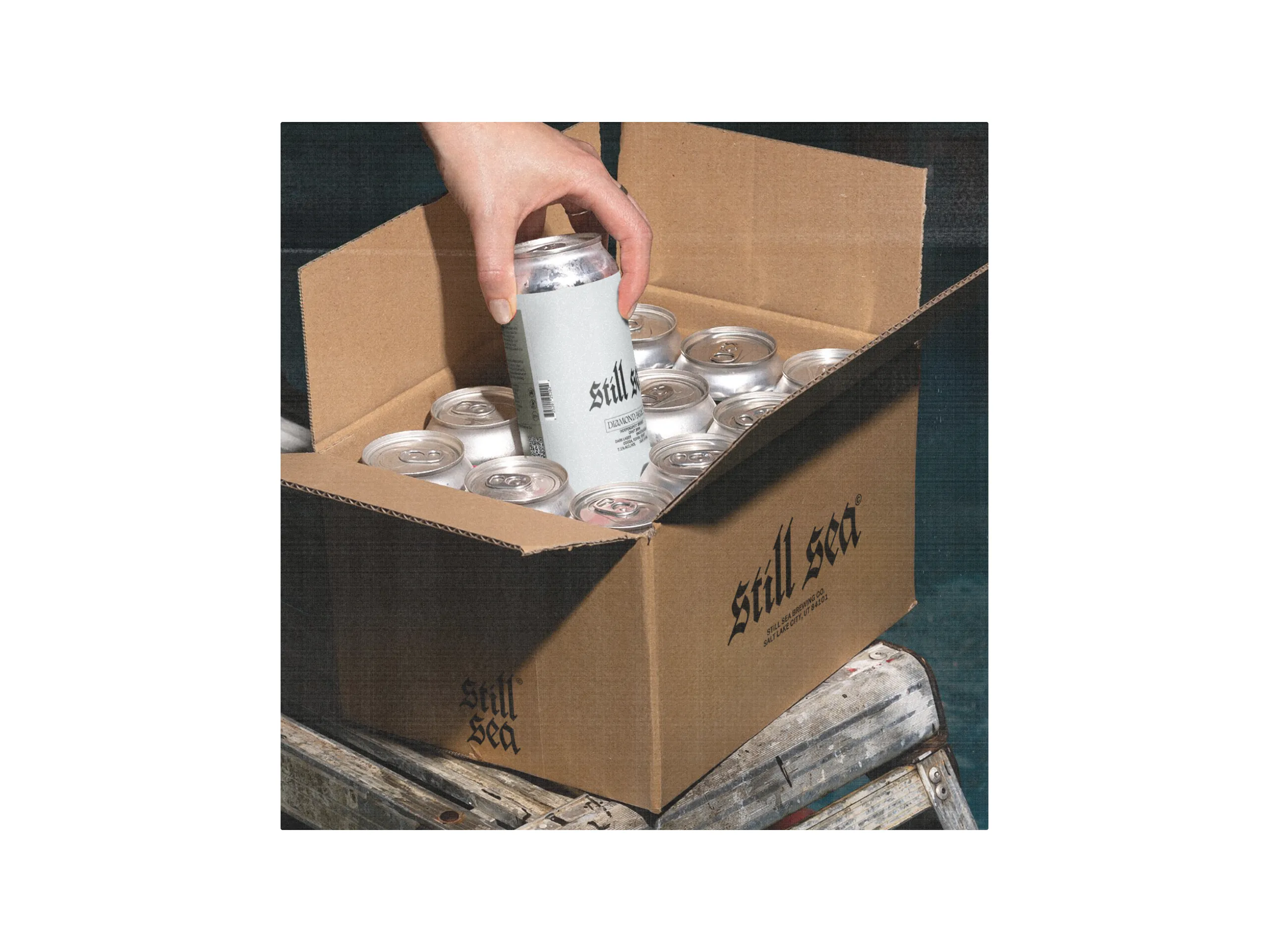
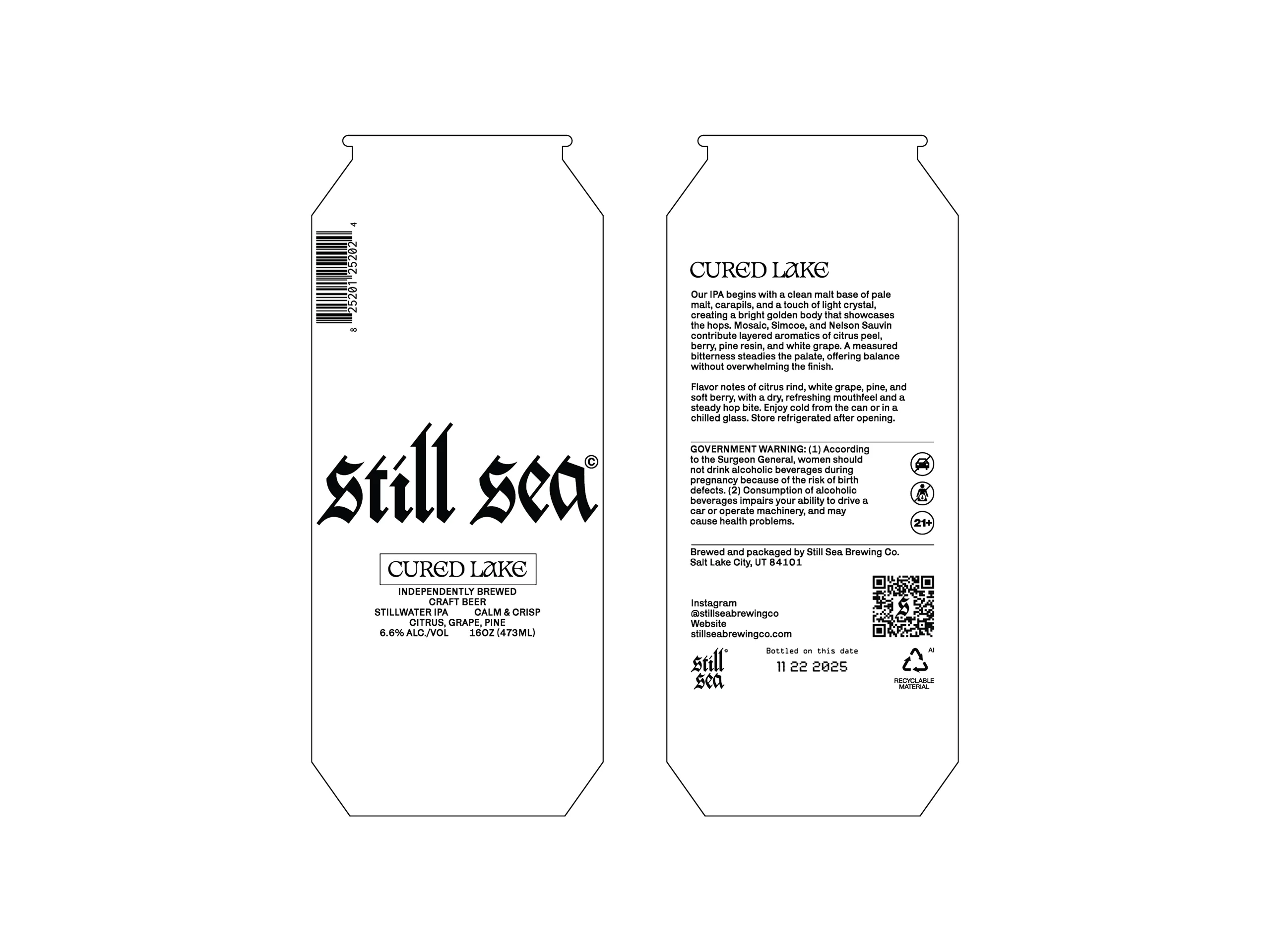
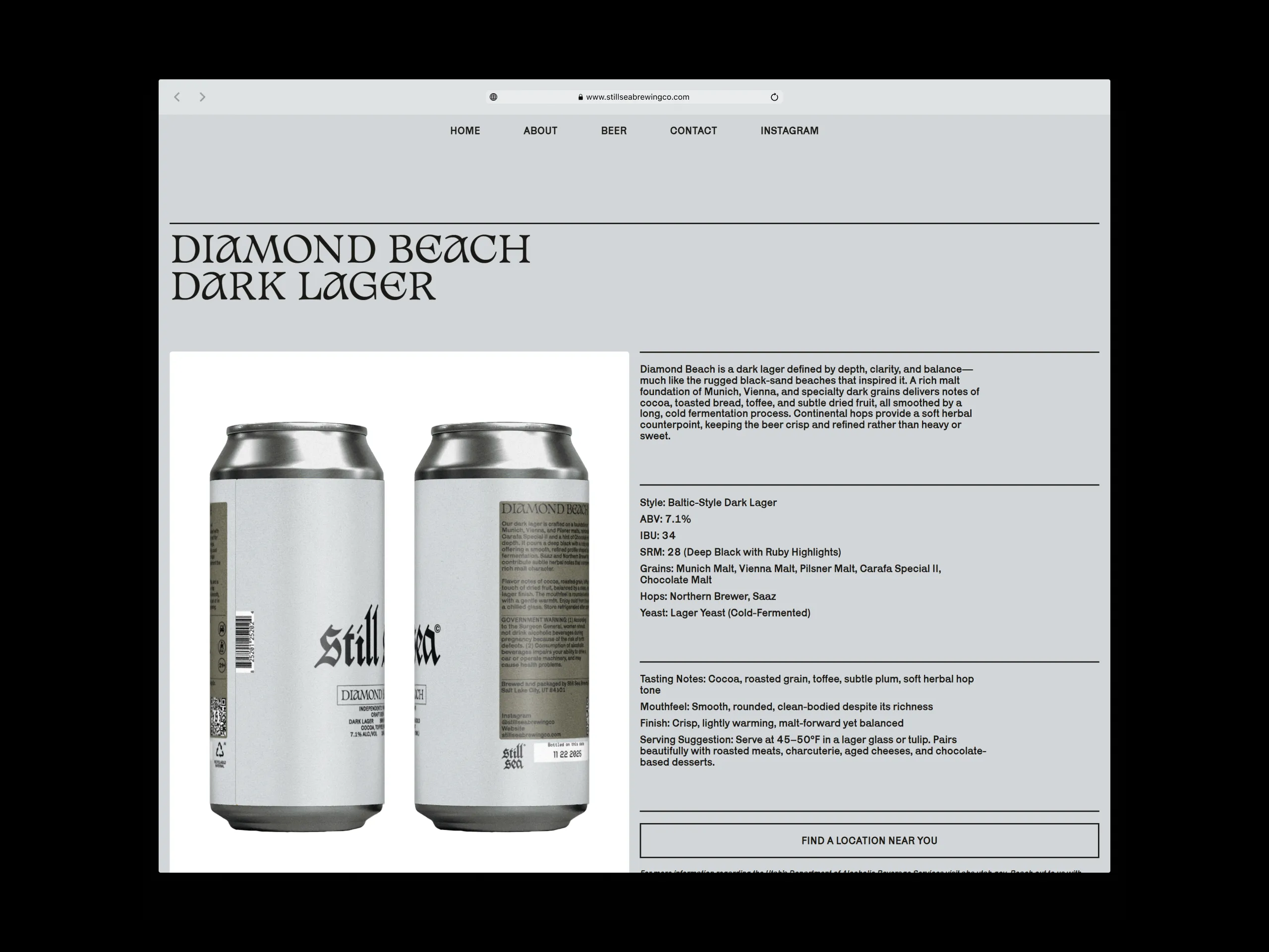
The project resulted in a clearly communicated design language for the brand that stands out through simplicity and starkness. The label designs are defined by a typography-heavy composition with a window of color used to differentiate individual drinks.
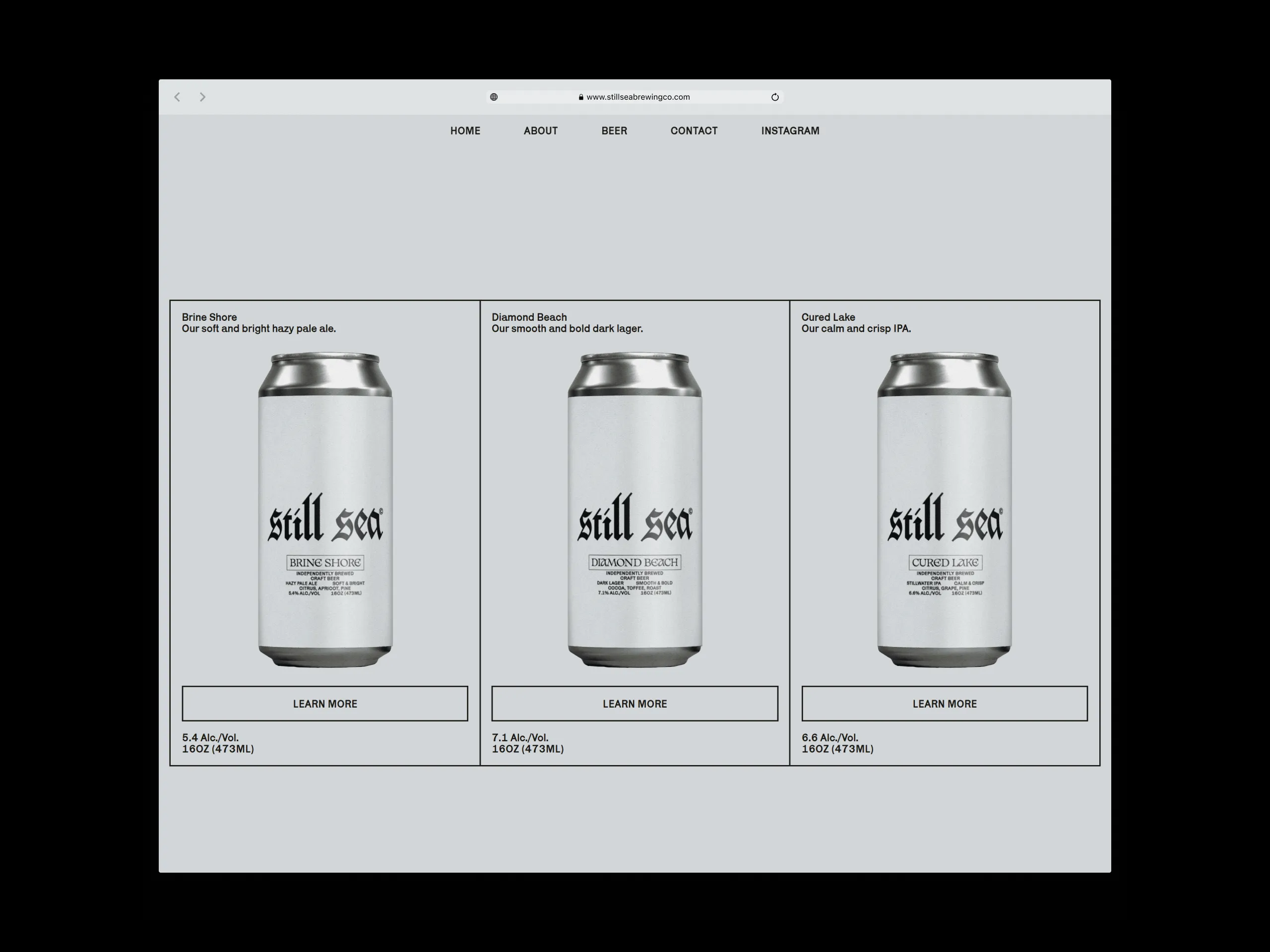
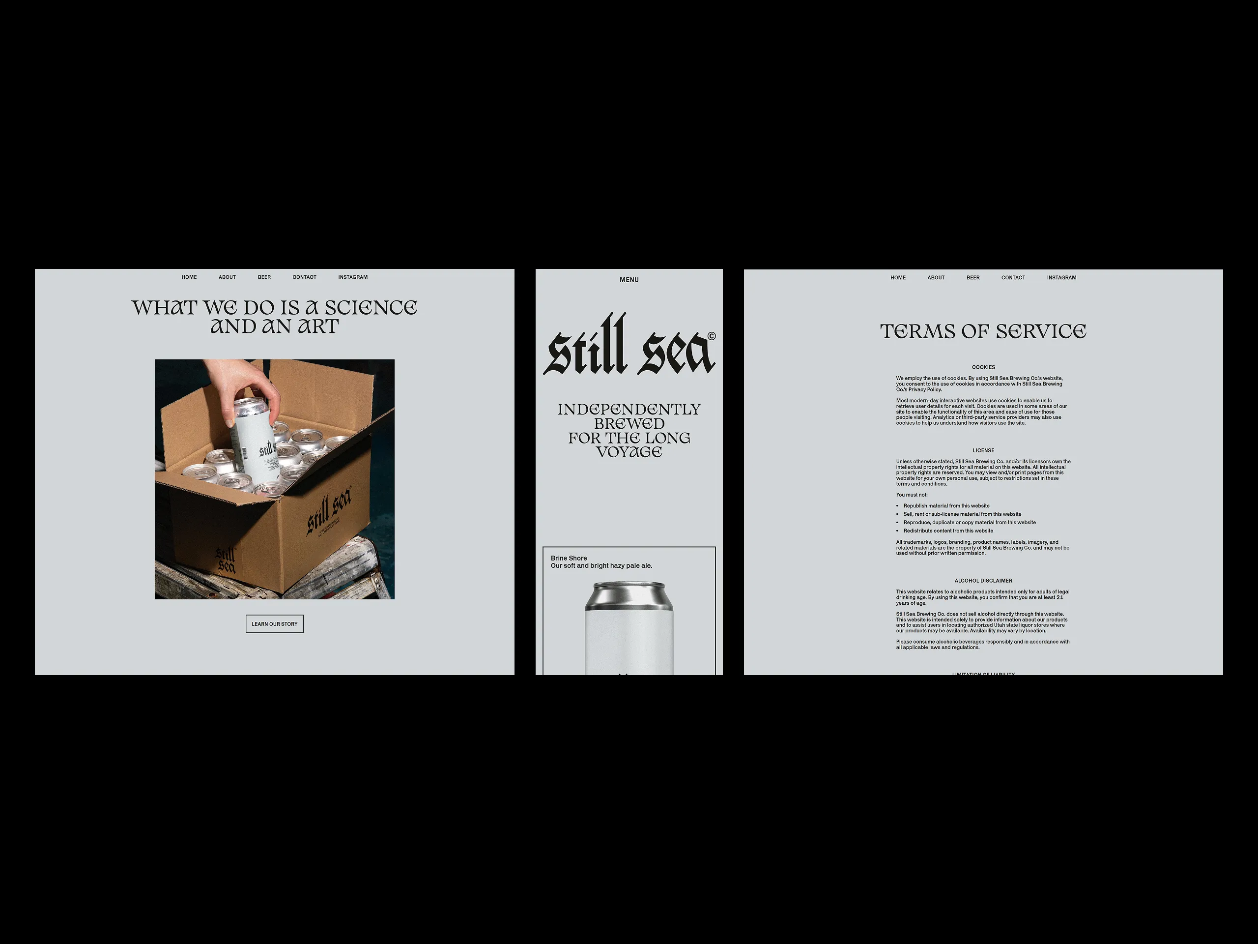
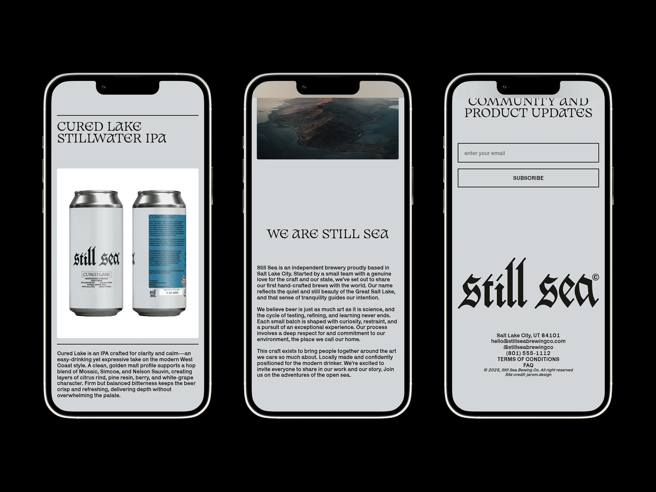
The website was designed as a simple, functional platform that introduces the brand, communicates its mission, and presents detailed product information. Built using only foundational web technologies, the site prioritizes accessibility, while a store locator tool guides customers in finding products at nearby state liquor stores.
